Chart Reports
Visualize balance values over time with Bkper Charts — drill into Group hierarchies and analyze trends interactively.
Bkper Charts represent balance values across any range of time, giving you a fast and visual way to analyze financial trends.
Opening Charts
There are two ways to open Charts in a Book.
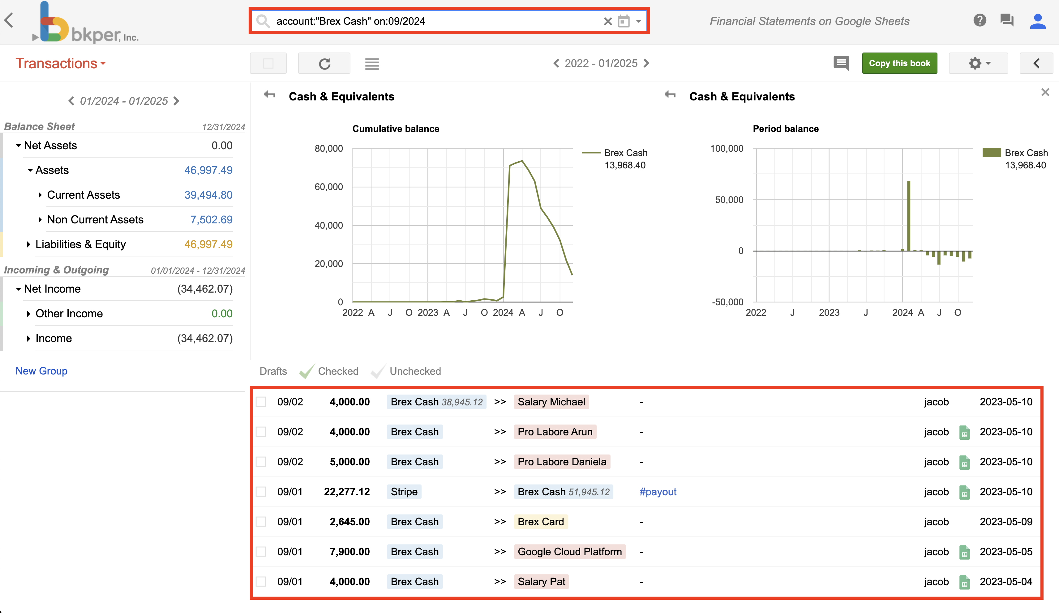
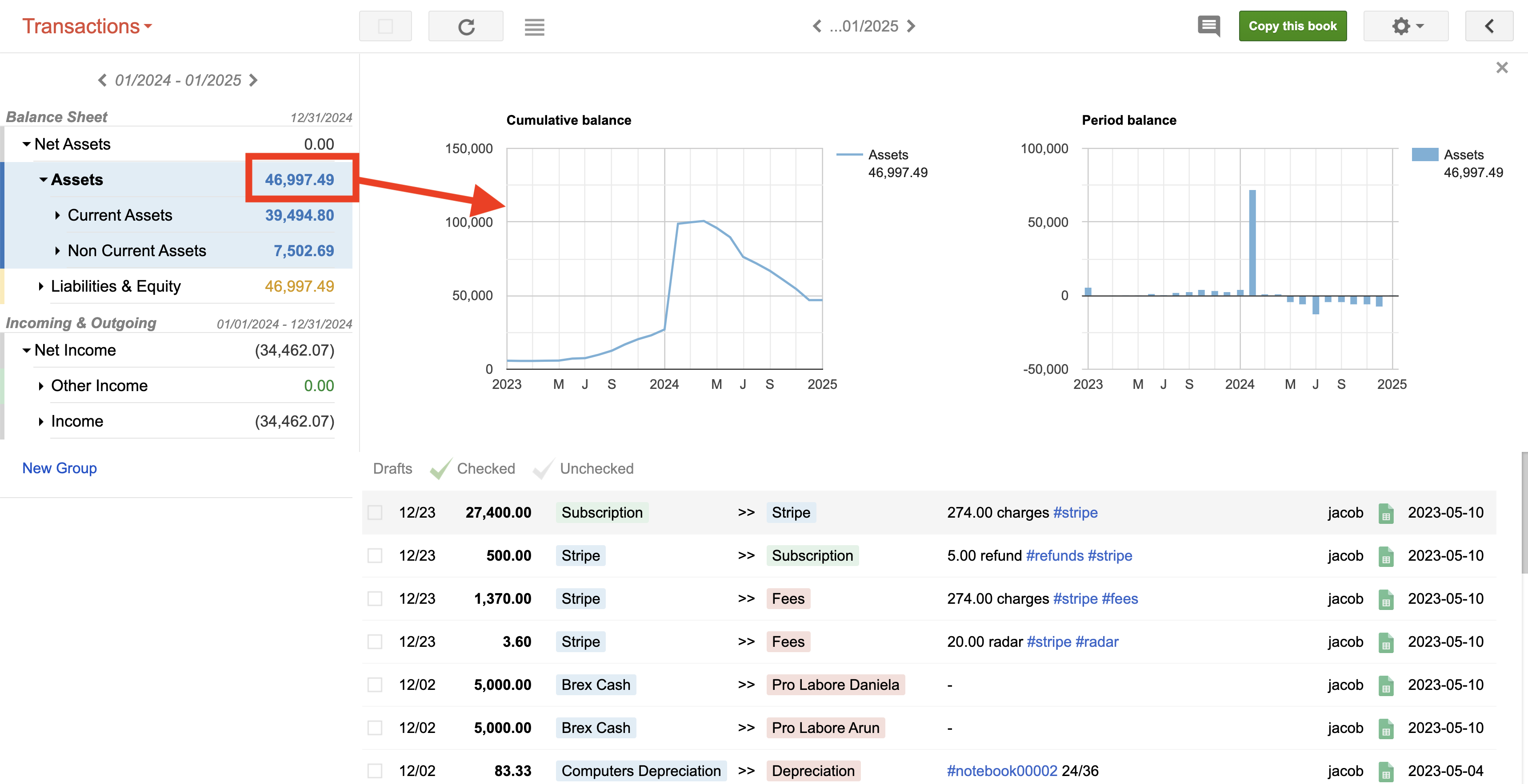
From a balance value — on the Transactions page, click a balance value next to any Account or Group in the left menu. Both the chart and the filtered transactions appear.
From the Charts button — click the Charts button wherever it appears in your Book to open the Charts panel.
Closing Charts
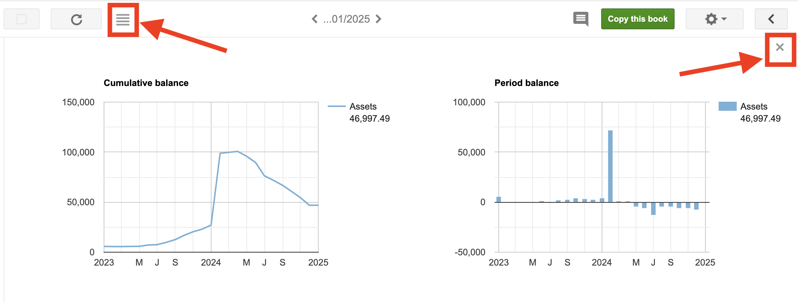
Click the X in the top-right corner of the Charts panel, or click the sidebar toggle button in the menu bar.
Interacting with Charts
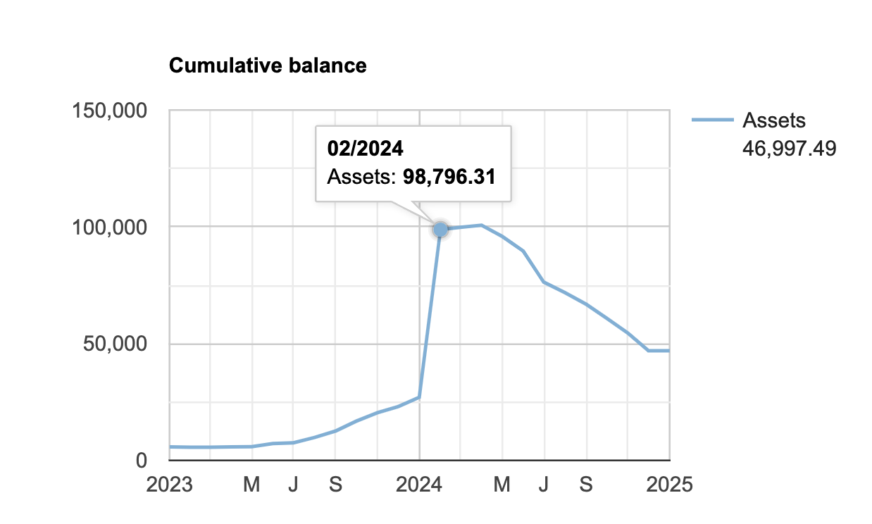
Hover over any line or bar to see the balance value on a specific date. The level of detail depends on the query in the search bar.
Drilling down through the hierarchy
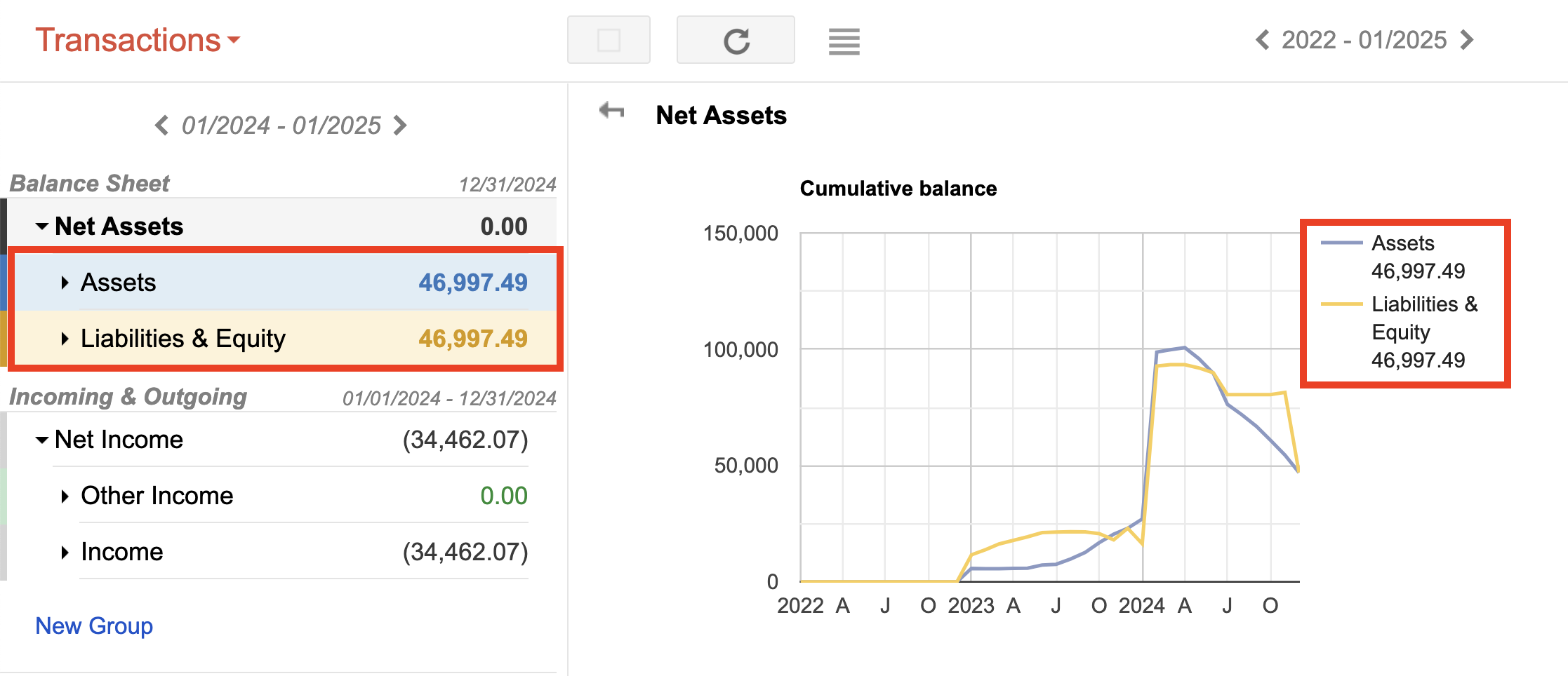
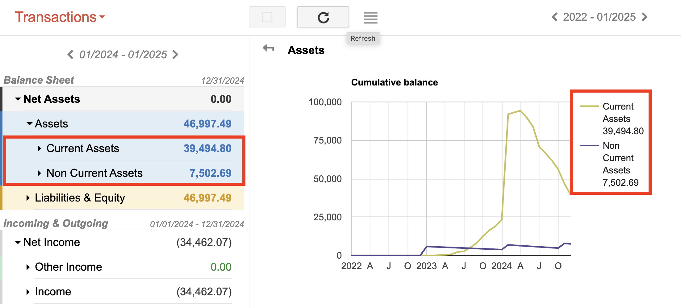
Charts mirror the Chart of Accounts hierarchy. Click on a line or bar that represents a Group to expand the next level of the hierarchy in the chart.
For example, starting at the top-level Net Assets Group:
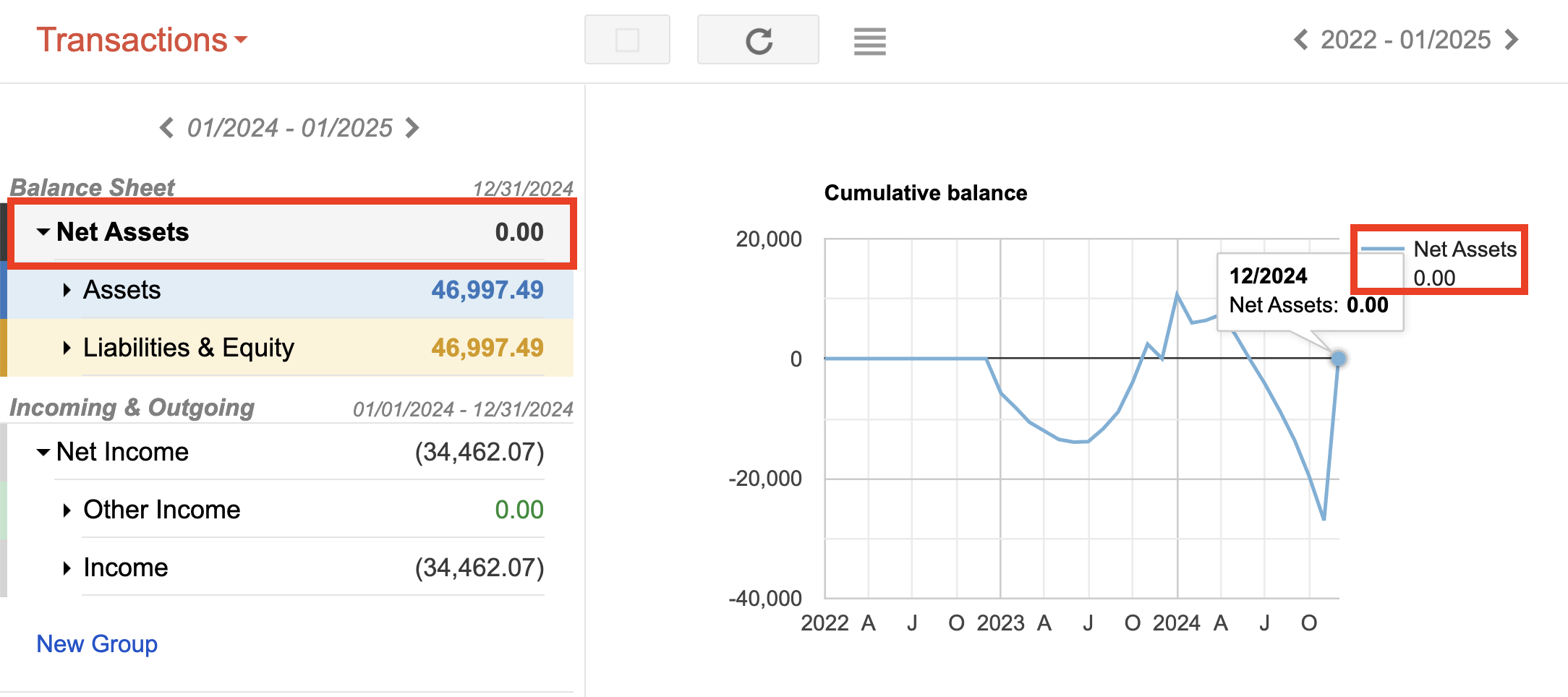
Click the Net Assets line to reveal Assets and Liabilities:
Continue clicking to reach the individual Accounts at the deepest level:
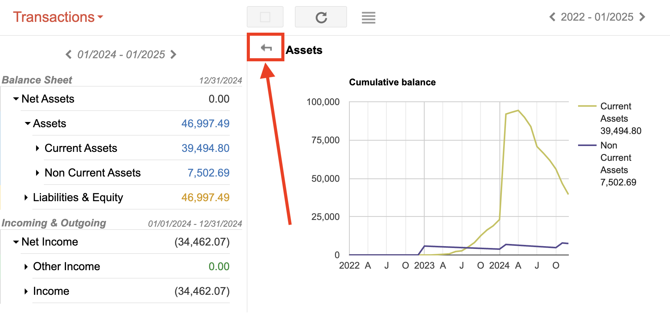
Click the back arrow in the top-left corner of the Charts panel to move up one level in the hierarchy.
Analyzing transactions from Charts
Click on an Account line or bar in the chart to update the transaction list below with only that Account’s transactions.